Brewing up better coffee branding for Niehoffs.

Identity, packaging and website for a modern organic coffee roastery.
Niehoffs stands for organic coffee done right – sustainable, fair, transparent. We started with a website relaunch and quickly expanded our scope. From visual identity and presentation templates to limited-edition packaging and two complete product rebrands – we helped Niehoffs sharpen its presence and build a brand system fit for growth.
Niehoffs
Website
Print
Corporate Design

A relaunch with values.

The new website clearly communicates what Niehoffs stands for: 100% organic. 100% flavour. 100% transparent.

We built a design system around these principles with strong typography, warm colour palettes, hand-drawn icons and a modular layout that makes the content feel accessible and connected.
Lush coffee blossoms and green leaves fill the image, overlayed with color swatches labeled Dark Green (#2F4329) and Light Green (#556B2F).Four icons: a bag of coffee, a coffee scoop with grounds, coffee beans, and a pour-over coffee maker. Green and white color scheme.
A person holds a smartphone displaying the Niehoffs website. The tone is natural and organic.A person holds a smartphone displaying the Niehoffs website. The tone is natural and organic.

Designed for digital and print formats.

We translated the new identity into a flexible presentation template for use in internal and external communications. In parallel, we designed roll-up displays for trade shows which are simple, bold, and easy to deploy across events.
Two green roll-ups display sustainable coffee packaging and private label solutions by Niehoffs Kaffeerösterei. Images of coffee bags and beans enhance eco-friendly themes.

Relaunch Roast.
A special edition.

To celebrate the website launch, we created a limited-edition coffee: The Relaunch Roast. From naming and illustration to label design, we developed this one in-house. A physical expression of the digital transformation.
Three brown coffee bags labeled "Relaunch Roast" with green and white labels displaying coffee details and QR codes, set against a light background.

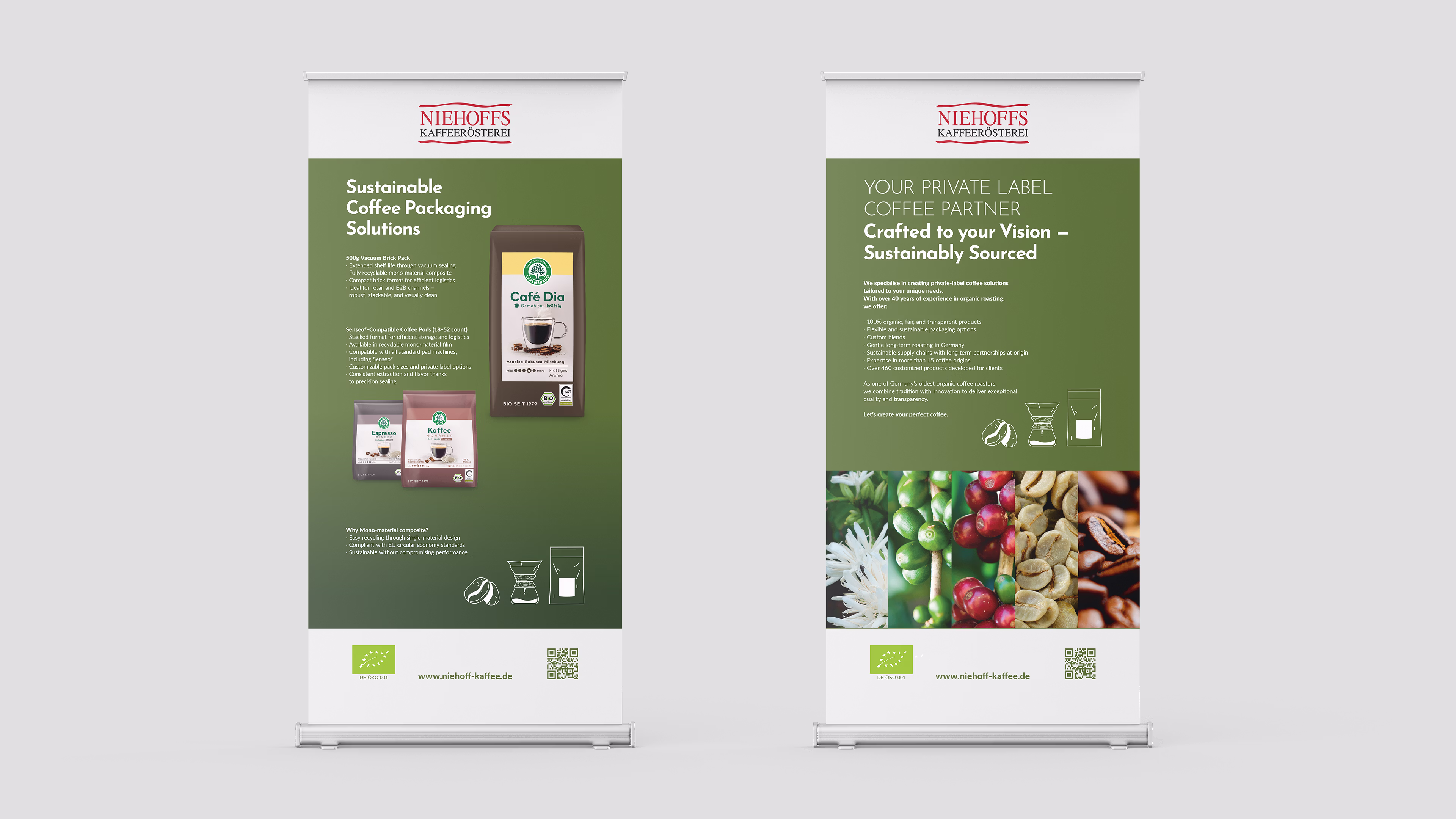
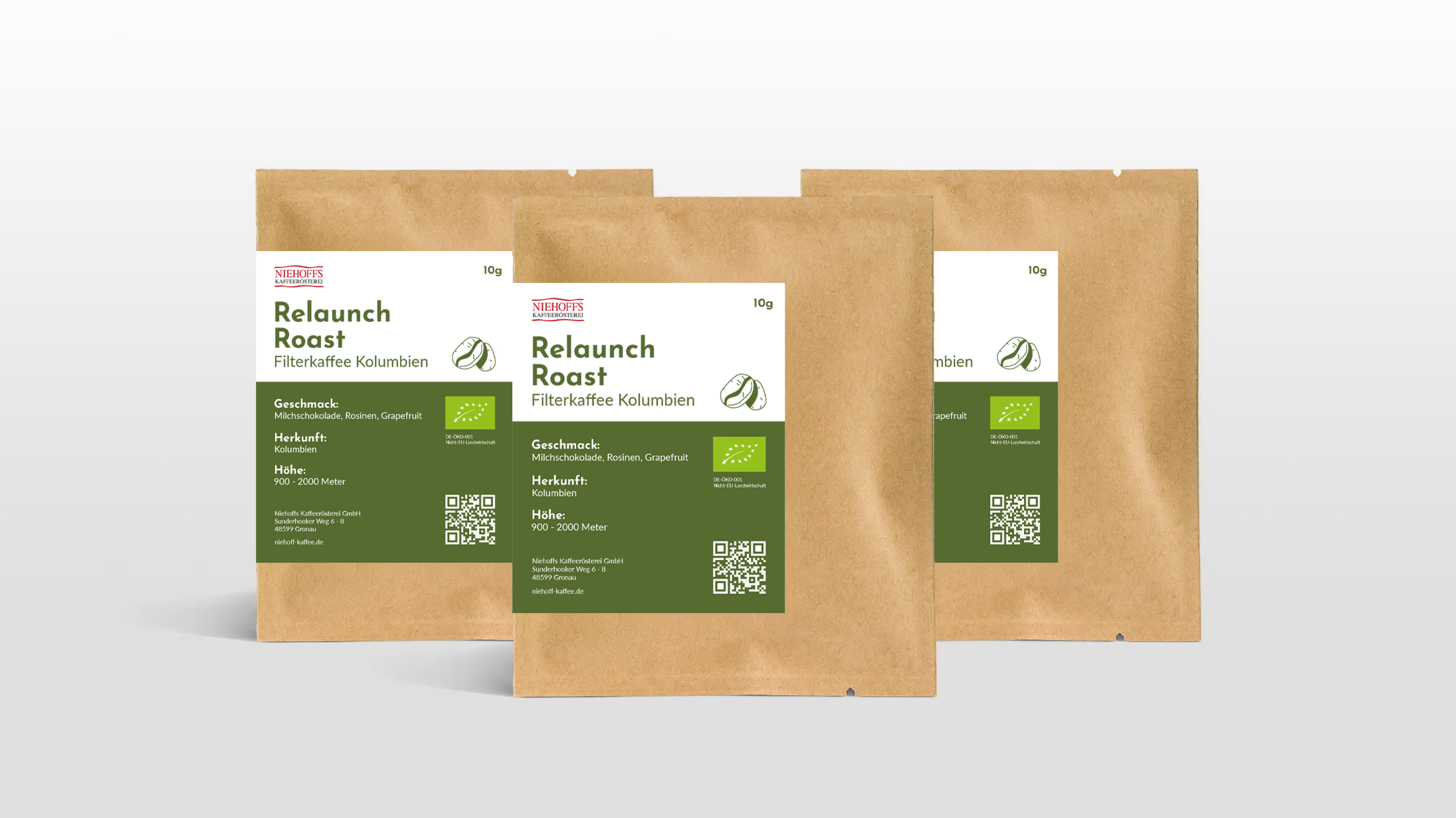
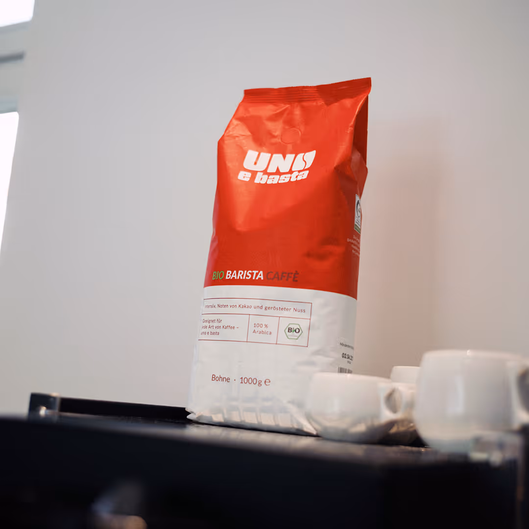
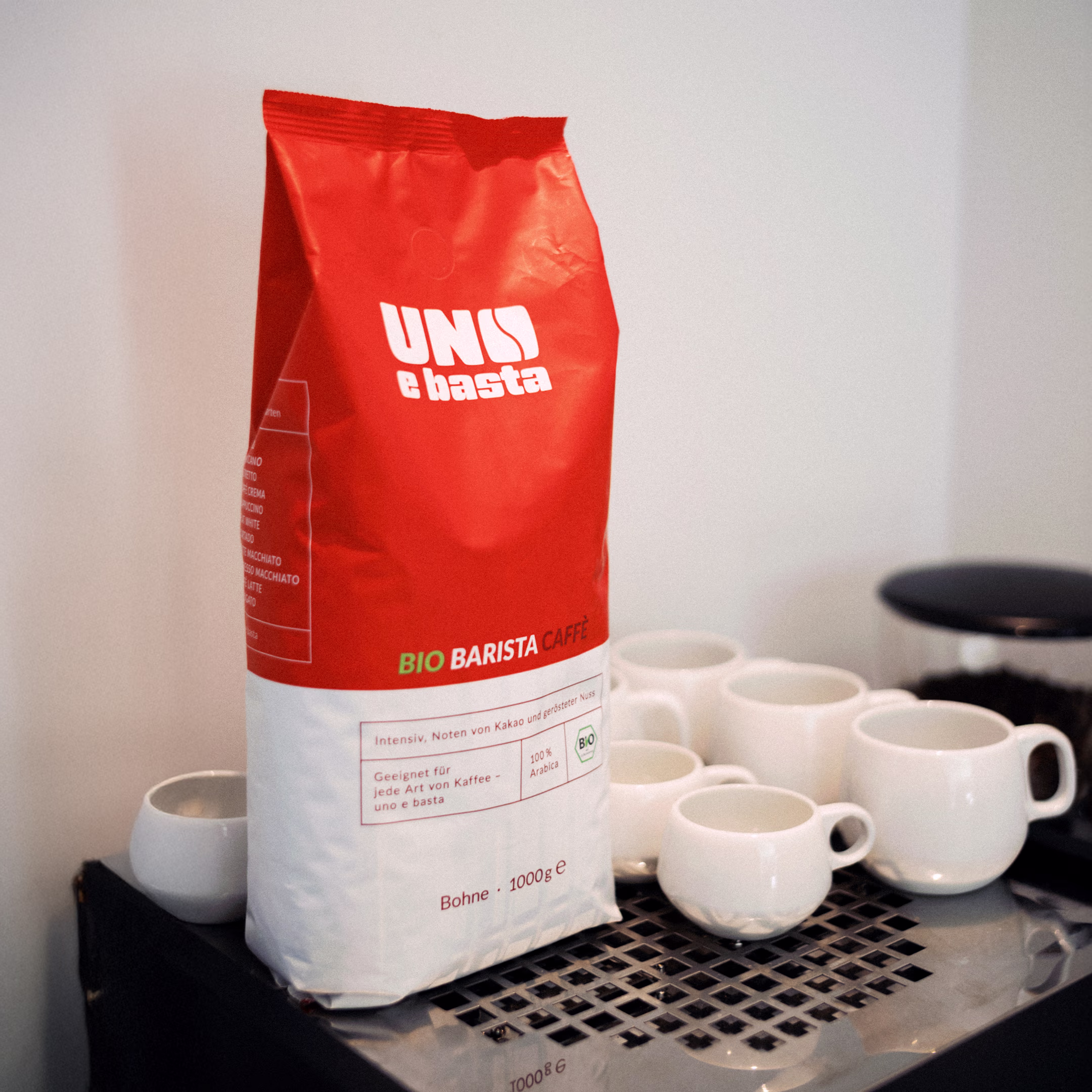
Two product brands. Reinvented from the ground up.

Uno e Basta and Coffea Natura were established brands within the Niehoffs portfolio,  but both required a more modern identity. So we completely redesigned both.

New logos, packaging, colours, and tone. Each product brand now speaks with a clear voice. Independently positioned, strategically aligned and with a stand-out look for the supermarket shelf.
Logo Grid layout.
Logo Grid layout.
A red and white bag of "Uno e basta".A red and white bag of "Uno e basta".

baslac – Branding

Next Work