Clarity for a complex industry.

A sharper brand presence for a consultancy built on expertise.
OSTHAVEN operated where payments, regulation and execution meet. Complex by nature. Clear in approach. We translated that mindset into a brand presence across campaign, employer branding, website and content.
OSTHAVEN
Campaign
Website
Motion
Large navy blue text 'OSTHAVEN' partially obscured by an abstract orange rounded shape on a light gray background.

Thinking in motion.

OSTHAVEN challenges industry narratives. Our campaign does the same. With animated 3D visuals that build each message step by step. Not decoration. But a visual logic.

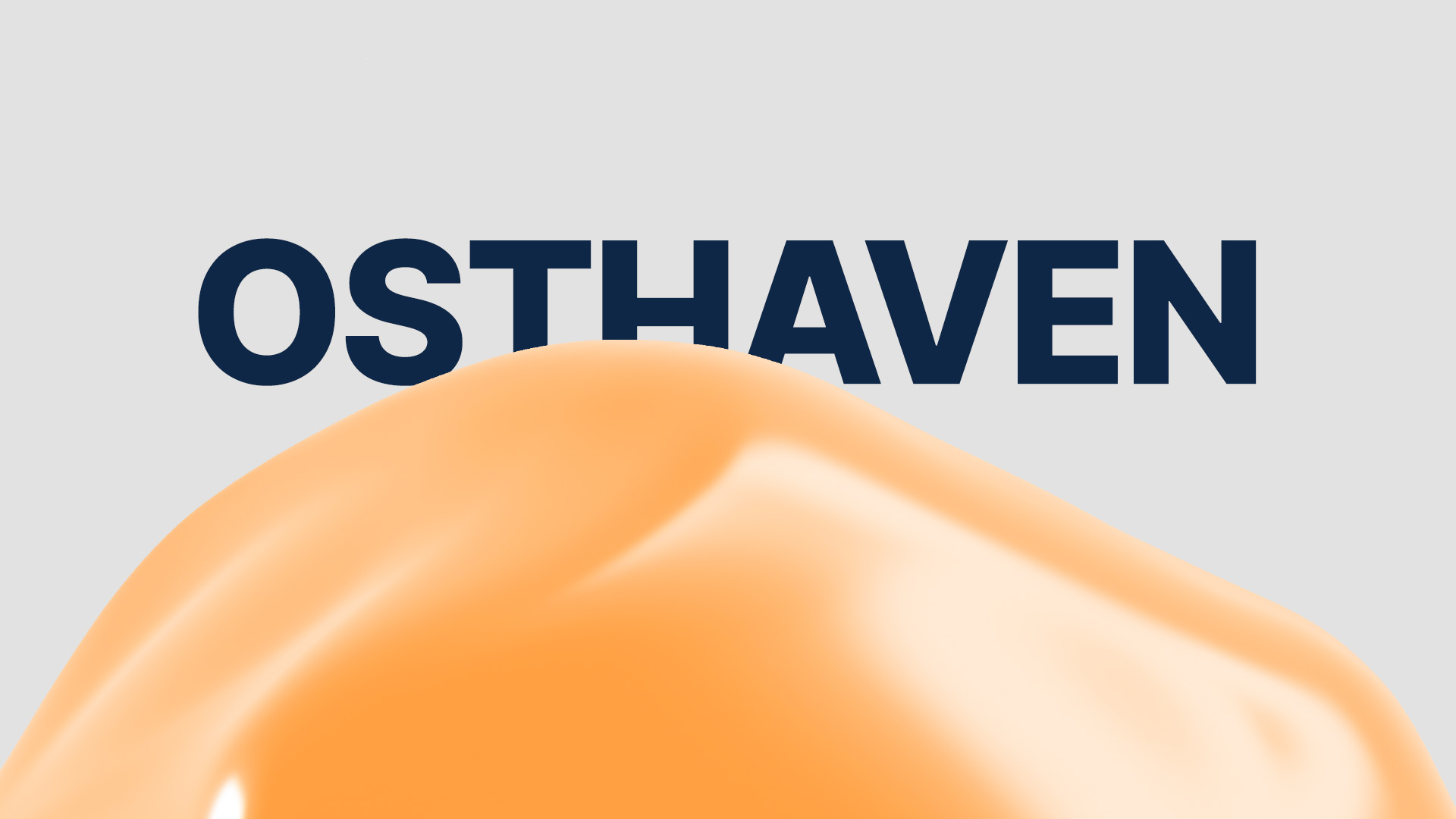
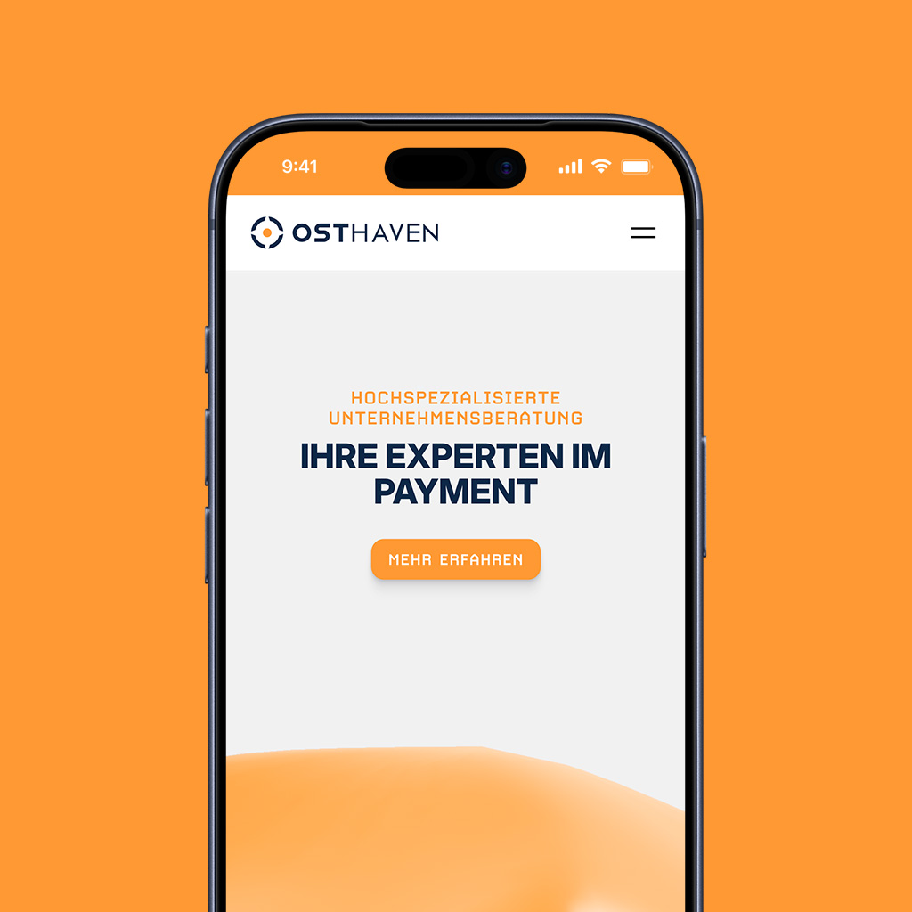
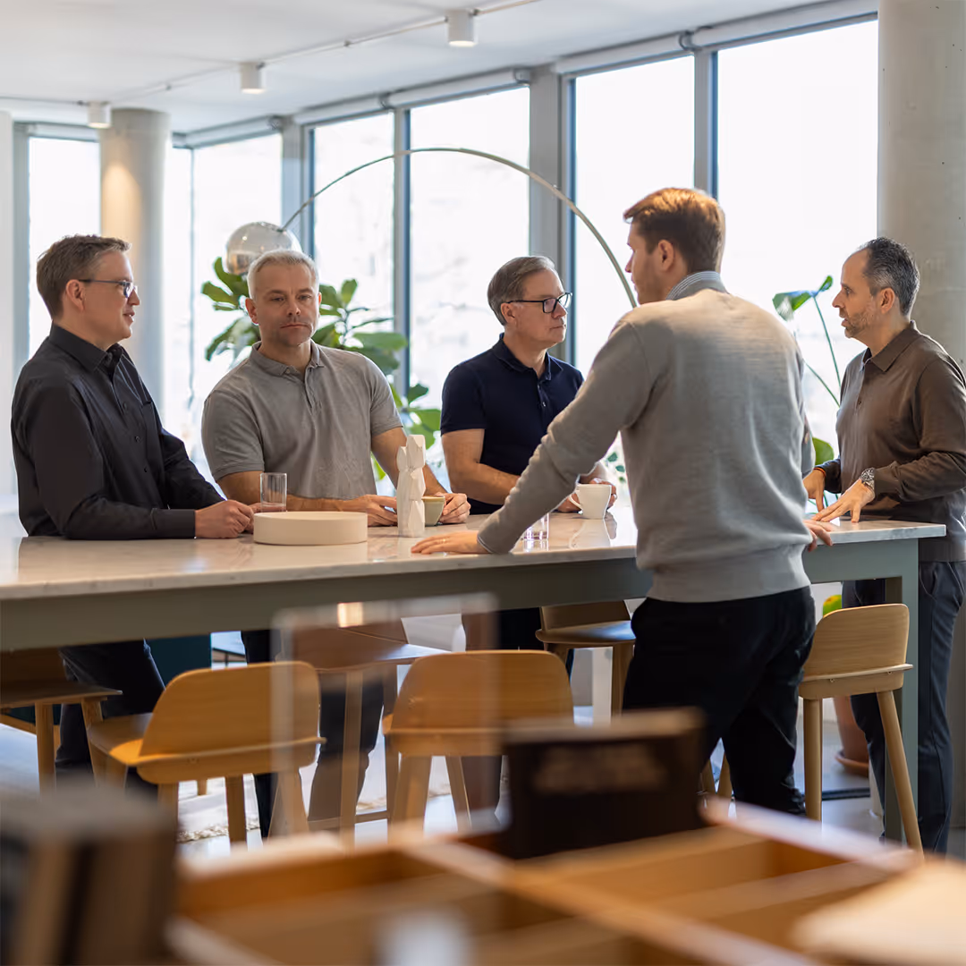
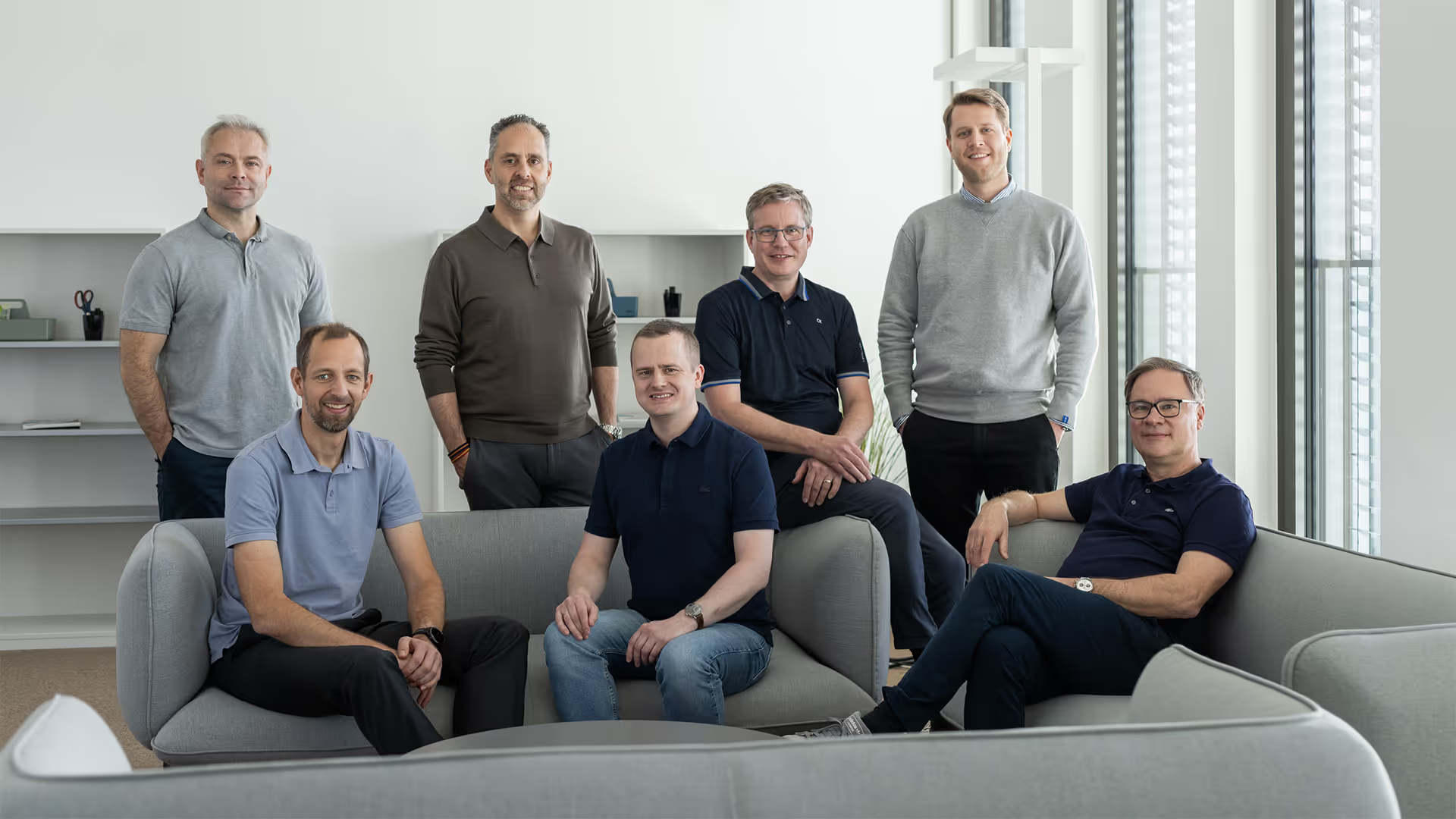
From template to tailored.

More depth in content. Better prepared references. More room for dedicated landing pages. And a complete shift in design: away from template logic, towards a fully custom look with strong motion and more detail. At last, the website reflects the quality of the consulting.
Mobile phone screen showing OSTHaven website with text: Highly specialized business consulting, your experts in payment, and a call-to-action button labeled Learn More.

No employer branding theatre.

No stock phrases. No polished-over promises. Instead: real insight into daily work, clear benefits, and a transparent application process. Straight from OSTHAVEN.
Four-step recruitment process with steps labeled 01 to 04 describing application, first interview, second interview, and final interview phases.
Timeline of daily routine starting with 7:30 AM breakfast with family, followed by 8:15 AM taking daughter to kindergarten, 8:45 AM project team catch-up, 9:00 AM remote workshop from home office, and 12:30 PM short lunch with friends.

Less cliché. More character.

No stiff consultant portraits. No dark-blue uniform look. A more relaxed approach. Still highly professional. The quality shows in the details.
Five men having a discussion around a large table in a bright office with large windows and plants.Man in a gray sweater smiling and talking to another person across a table with a tablet in a bright office space.
Young man with short brown hair in a light gray sweater standing near large windows in a bright indoor space.Man with short hair and beard gesturing towards a board while looking to his left in a modern office room.
Group of seven casually dressed men posing in a modern office seating area with grey sofas and large windows.

Built to stop the scroll.

Complex topics need more than generic business visuals. For social, we turned payment topics into bold 3D imagery, clear metaphors and a distinctive visual system. Recognisable at first glance.
Gold Bitcoin coin riding a glowing orange roller coaster track representing cryptocurrency volatility.
Digital artwork of a modern glass building with orange and black abstract brush strokes and a pattern of five black stars on the top right.
Turtle holding a blue credit card in its mouth against a solid orange background.Instagram post showing a bitten and decayed apple next to the word 'PAY' on an orange background.

Content put to work.

We helped OSTHAVEN bring existing content into market. From the print production of the Payment 2034 report to its digital promotion with landing page and sign-up flow. Plus lead generation for assets like whitepapers.
Person holding an open magazine showing an article titled 'PULL & PAY' with an illustration of a hand and bar tools on the left page.
Black and orange graphic wishing Happy New Year 2034 with a cocktail glass filled with ice and a lemon slice, and text about the future of payment services.Robot hands holding a study titled 'PAYMENT 2034' with text about future payment trends and a free download offer.

baslac – Branding

Next Work