Turning corporate design into a practical brand system.

Enabling consistent communication across global teams.
ROSEN had introduced a new corporate design, but its practical application across teams and formats proved challenging. Our task was to translate the visual identity into a structured system that could be applied consistently in everyday communication. Working closely with the internal design team, we refined key elements of the brand and developed a comprehensive toolkit that enables efficient and scalable brand communication across global markets.
ROSEN
Corporate Design
Strategy
Print
Website

Refining the corporate design.

Our first step was to analyse the existing visual system and identify areas where the brand lacked clarity and consistency.We refined key elements such as colour usage, logo placement and the role of distinctive design components like the ROSEN “Loop”.

The goal was not to reinvent the brand, but to strengthen its clarity and recognisability across all applications.
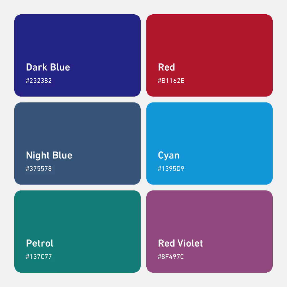
Color palette showing six colors with names and hex codes.
Digital visualization of a futuristic glowing pipeline running through a rural landscape at dusk with distant city lights and hills.
Blueprint-style design of the ROSEN logo.
Four blue line icons on a white rounded square: a bandage, a vest, a shirt on a hanger, and a hand pressing a button with an arrow.Person holding the brim of a white knit beanie labeled 'ROSEN' pulled down over their eyes against a gradient blue background.
Browser tab showing the URL rosen-group.com with the favicon.Welder wearing protective gloves and helmet welding inside a large metal pipe with sparks flying.
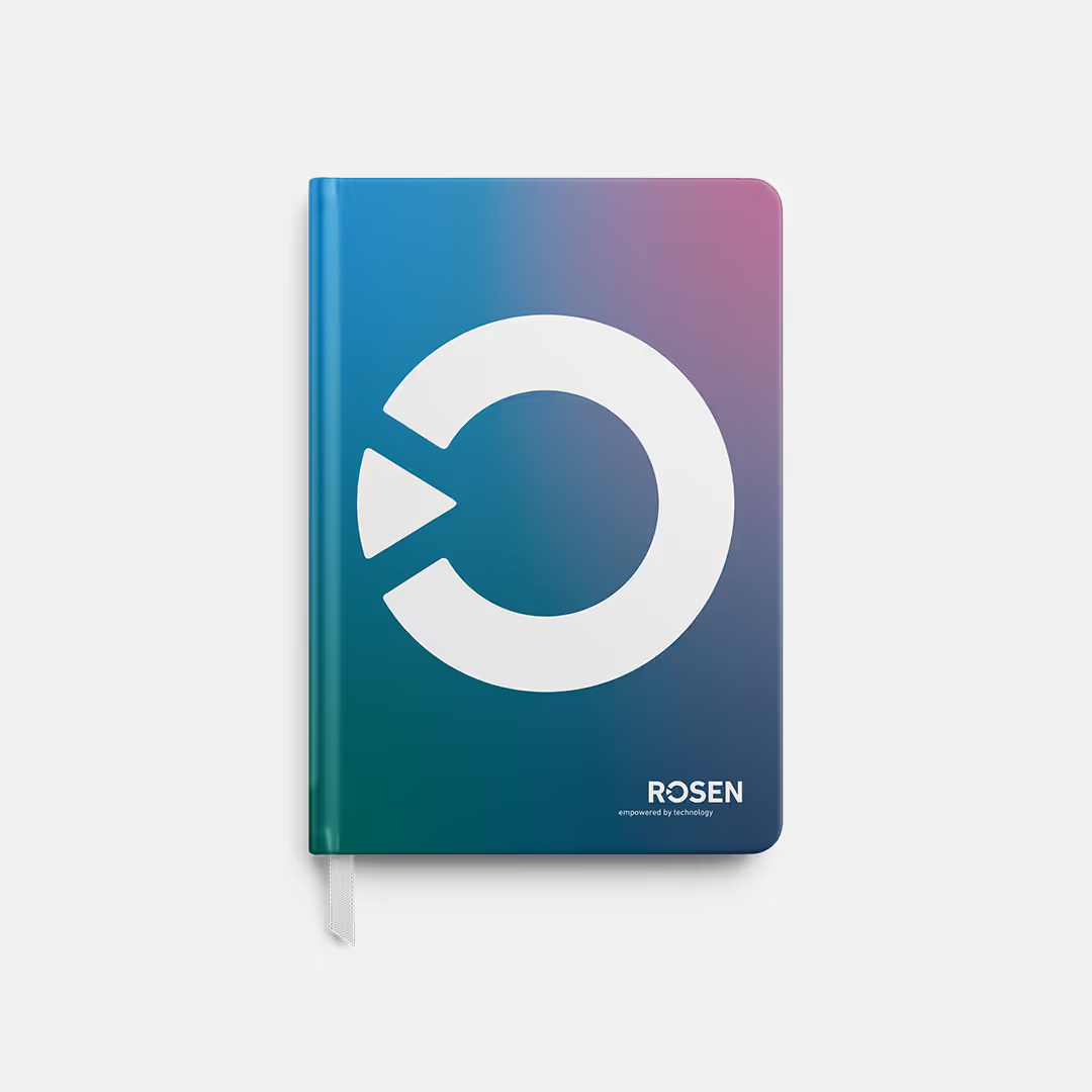
Aerial view of a forest with a winding road illuminated by neon blue light and overlaid with colorful digital data points and lines.Closed notebook with a blue to purple gradient cover featuring the white ROSEN logo and the text ROSEN empowered by technology.

Building a practical brand toolkit.

A design system only works if it can be applied easily in day-to-day work.
Together with ROSEN’s internal design team, we translated the refined corporate design into a practical brand toolkit with clear rules, modular templates and defined layout systems.
‍
This enables teams to create consistent communication across presentations, campaigns, social media and print formats.
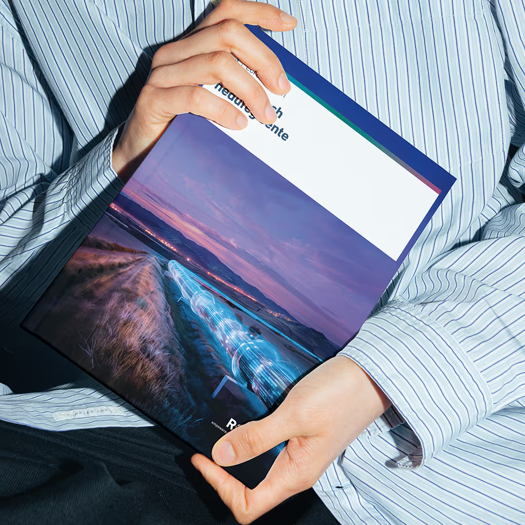
Person in a striped shirt holding a brochure with a digital pipeline image on the cover.Hand holding a smartphone displaying a social media post.
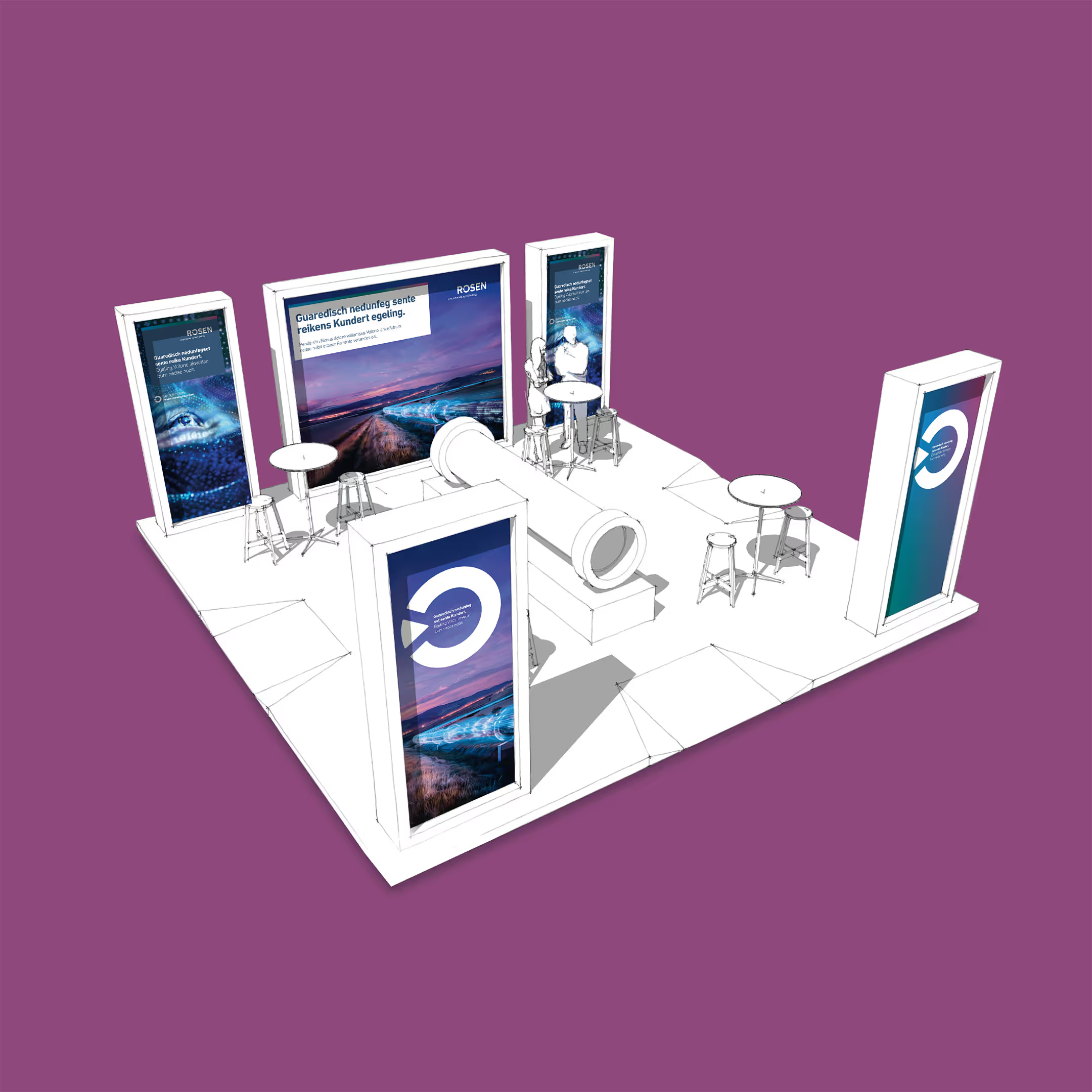
3D rendering of an exhibition booth layout with multiple tall display panels, round tables with stools, and a large central tube-like structure on a white platform against a purple background.Hand holding smartphone displaying a website in German about industrial asset solutions for various business sectors with images of oil, gas, mining, and offshore industries.
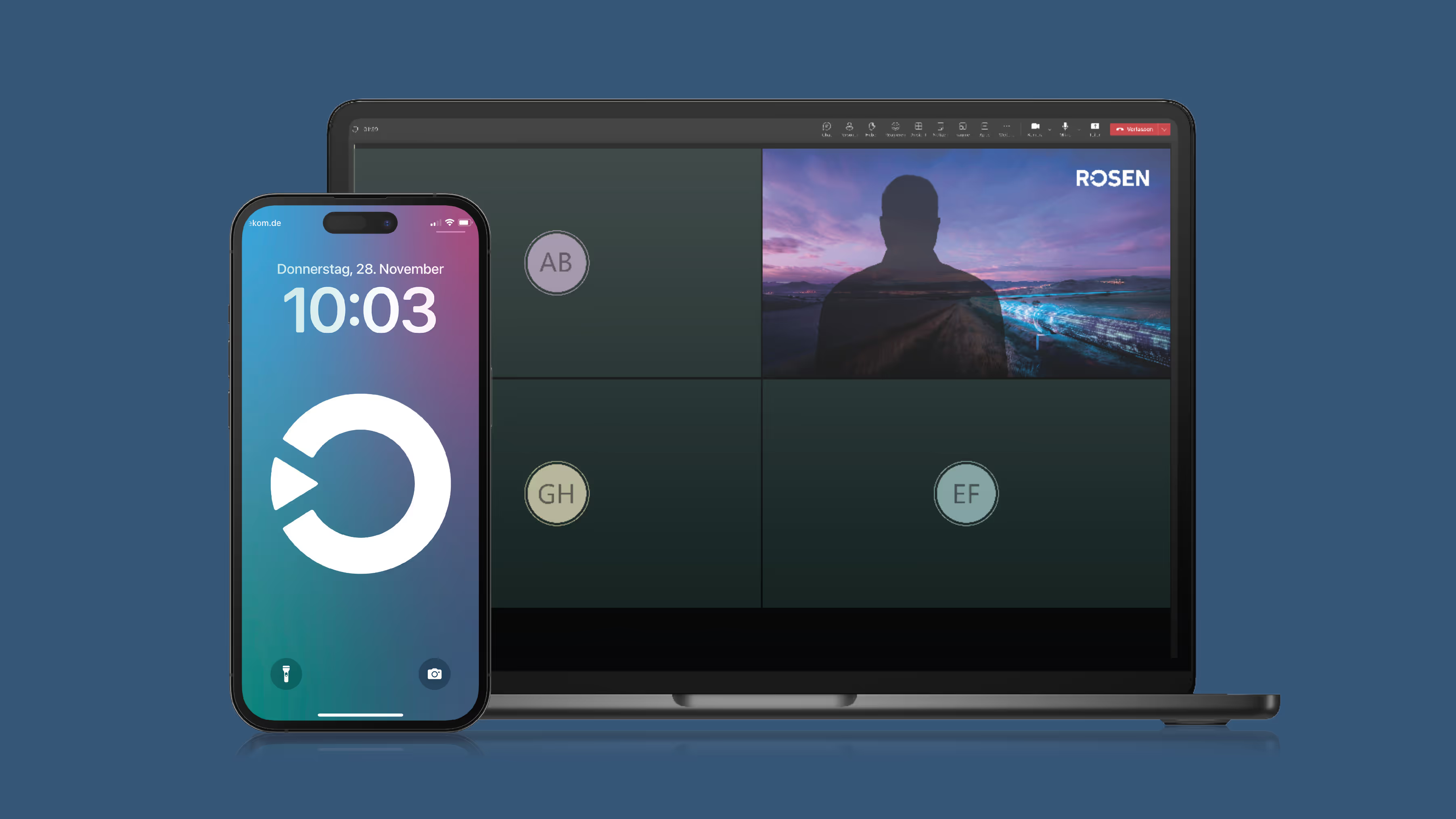
Smartphone displaying a lock screen design, next to a laptop showing a video call background.
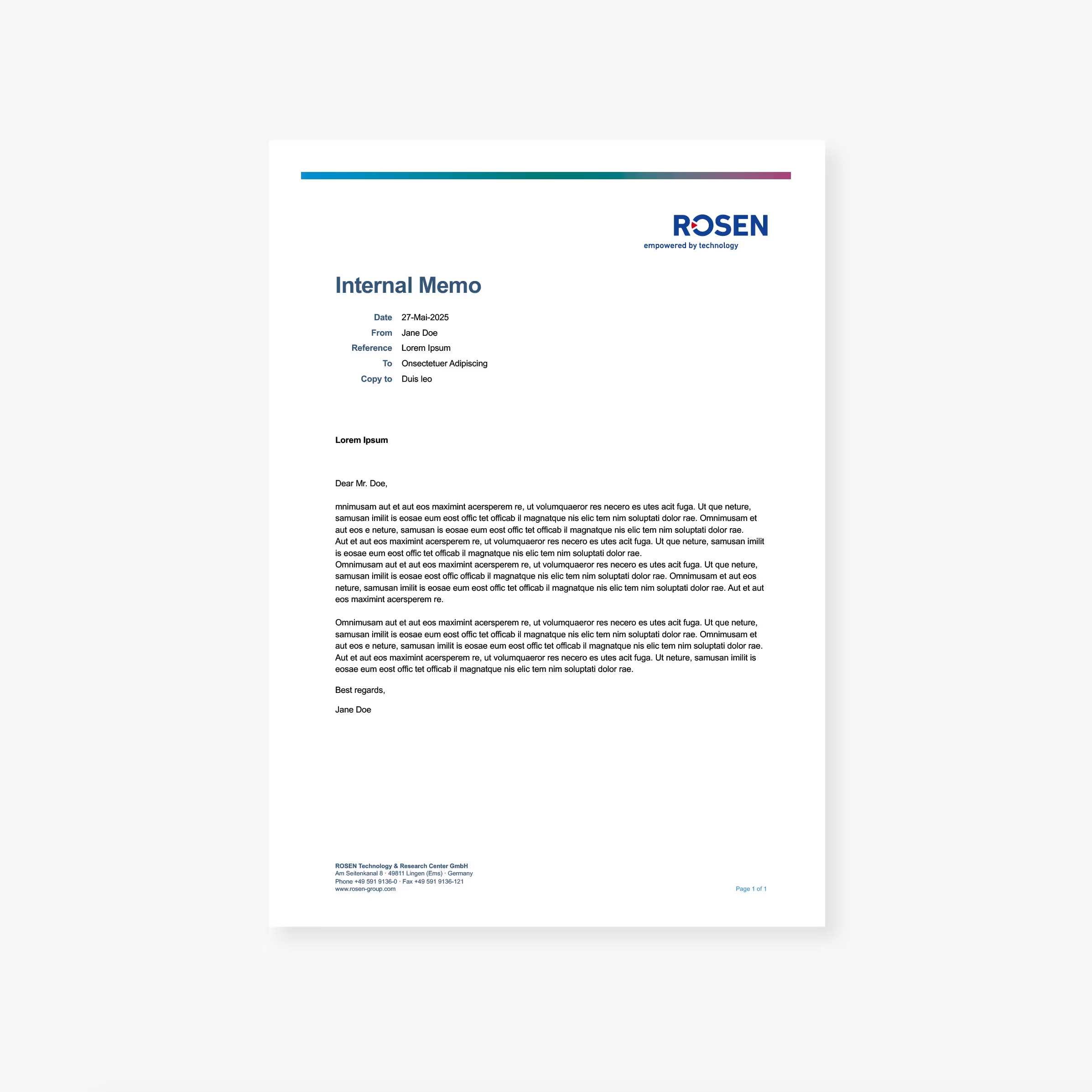
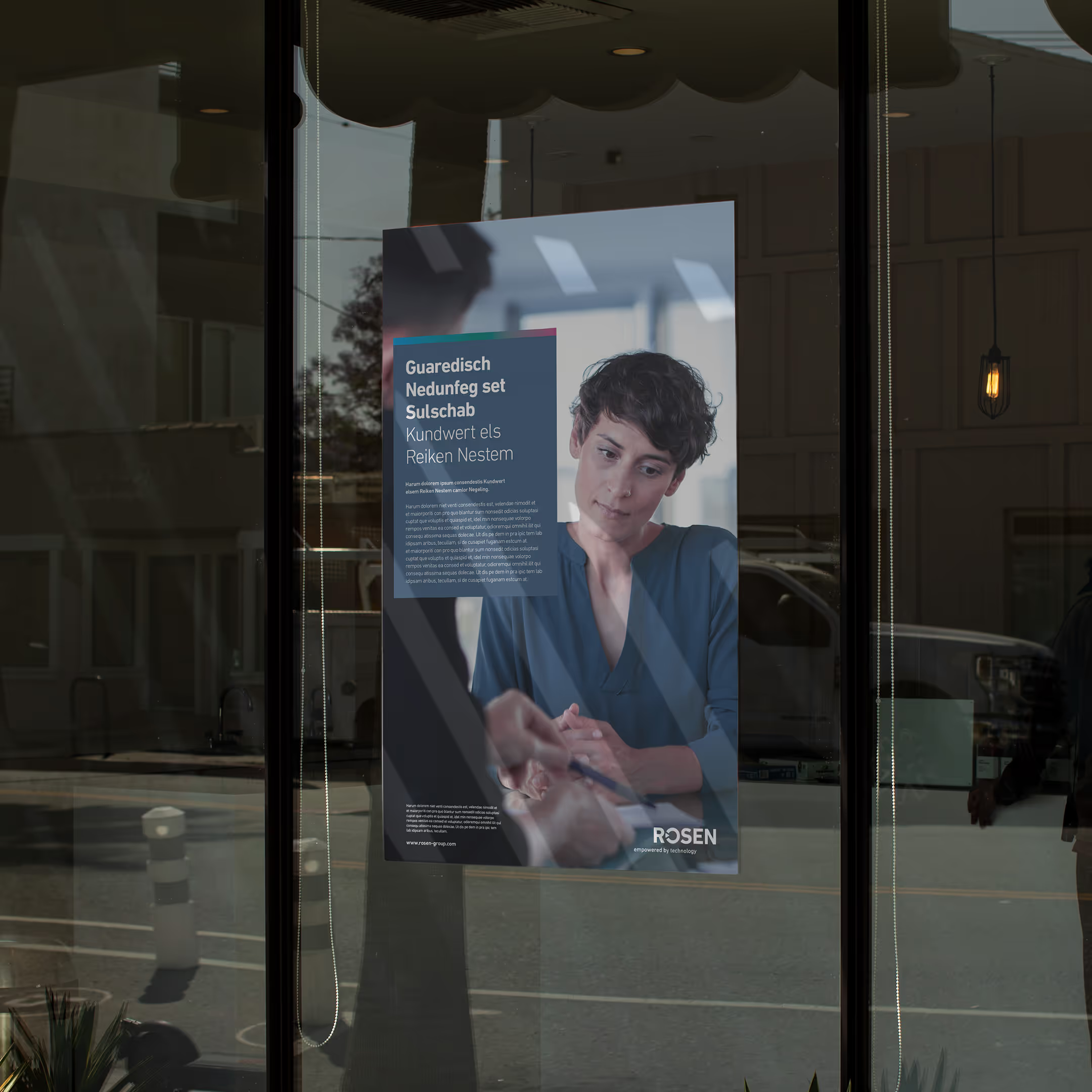
Internal memo with placeholder text and ROSEN logo at top right.Poster on a glass door showing a person in blue attire attentively listening to another person holding a pen, with text and the ROSEN logo.
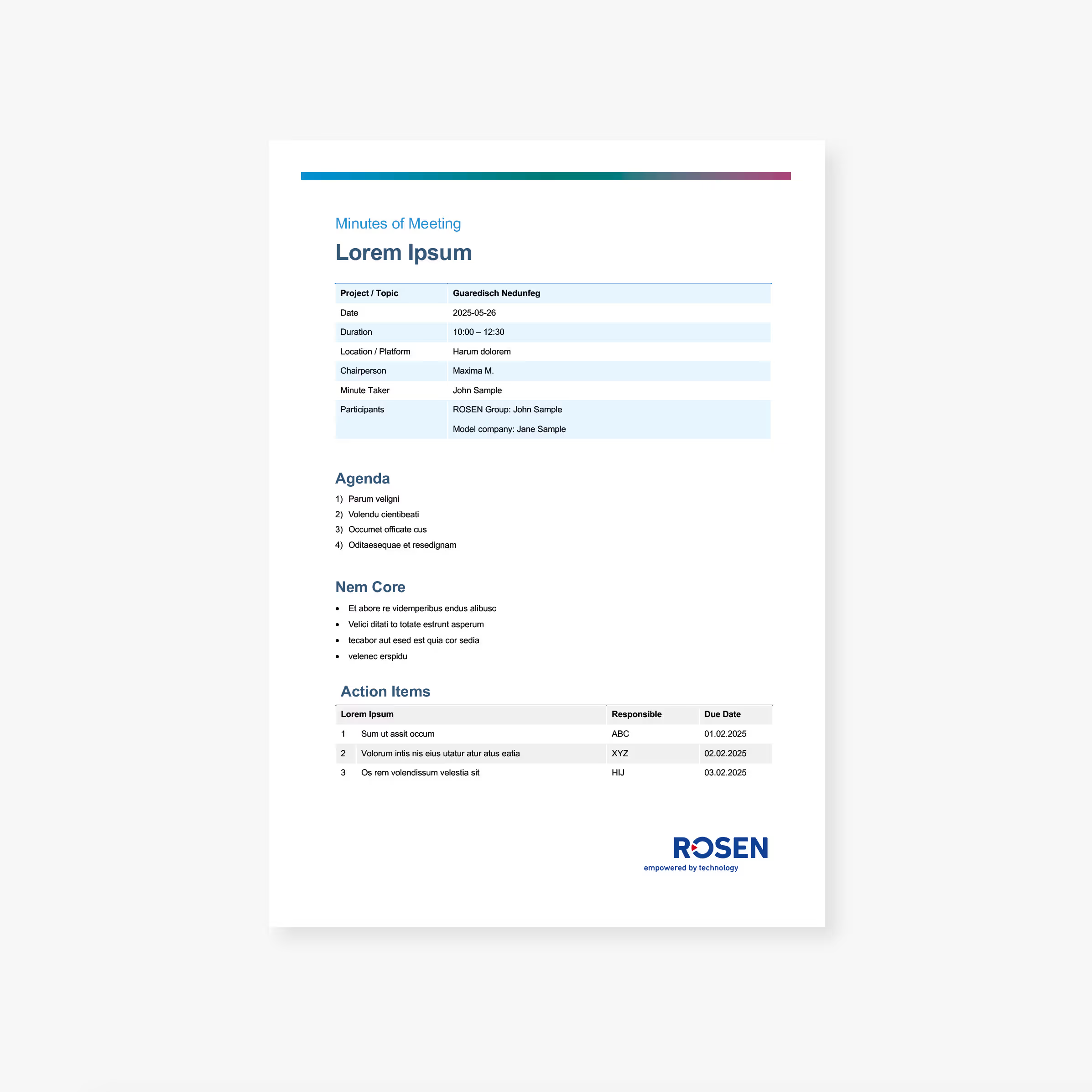
Document with placeholder including agenda, core notes, and action items table listing tasks, responsible persons, and due dates.
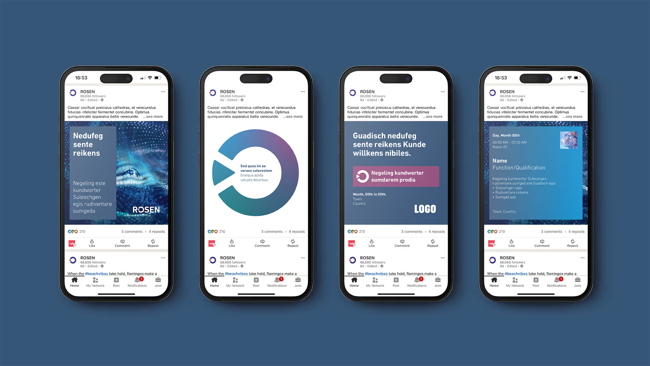
Four smartphones displaying different social media posts with charts, text blocks, and user interface elements on a blue background.

Extending the brand into motion.

To ensure brand consistency in digital communication, we translated the visual identity into a motion system.Animation principles, transitions and motion behaviours were defined to reflect the technological precision of the ROSEN brand.

The resulting motion toolkit provides both clear guidelines and ready-to-use assets for video, presentations and digital formats.

baslac – Branding

Next Work